Scale House
// Branding

Overview
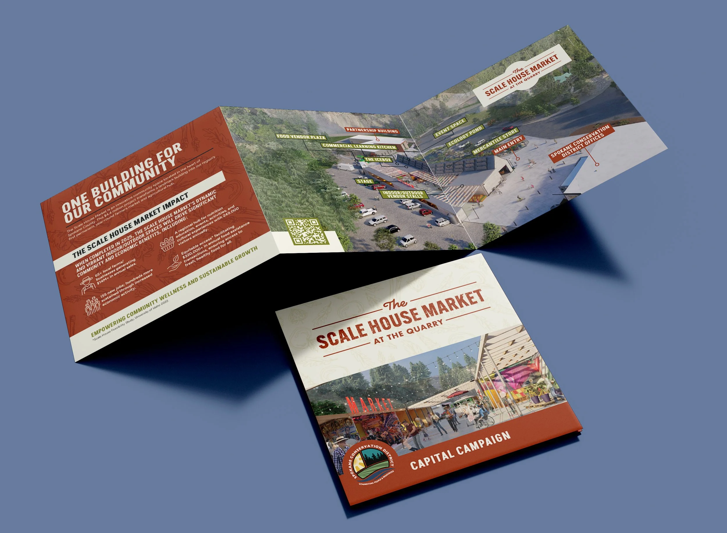
The Scale House Market, Spokane's first year-round market and community hub, needed a distinctive and cohesive brand identity. The challenge was to create a logo that reflected their mission of fostering vibrant relationships and community engagement while balancing modern and traditional elements.
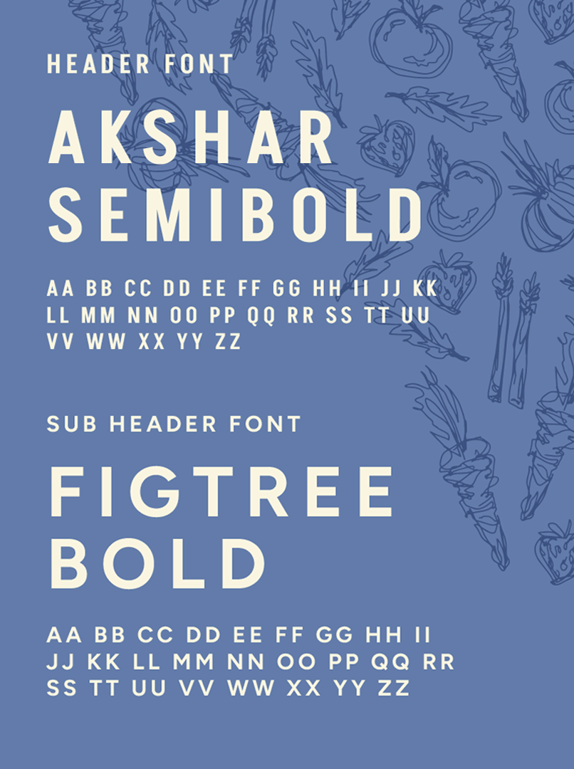
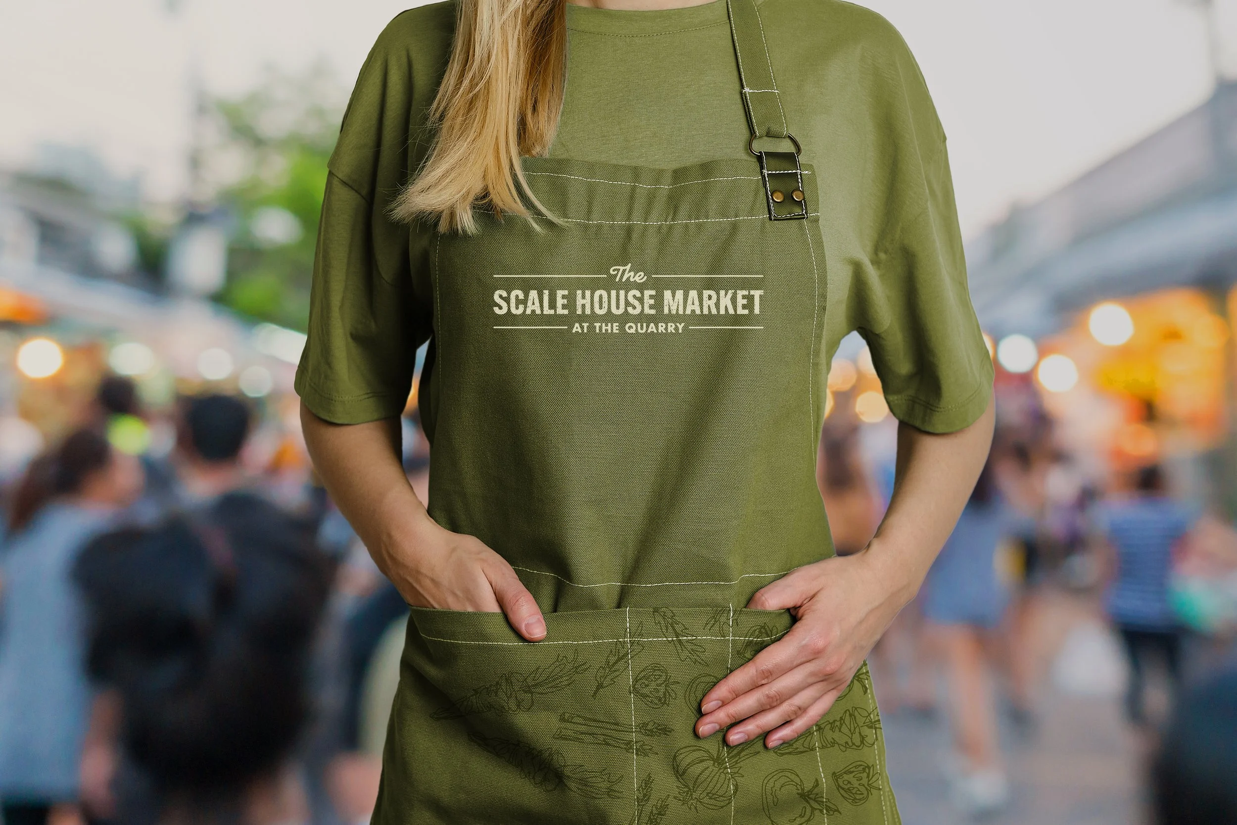
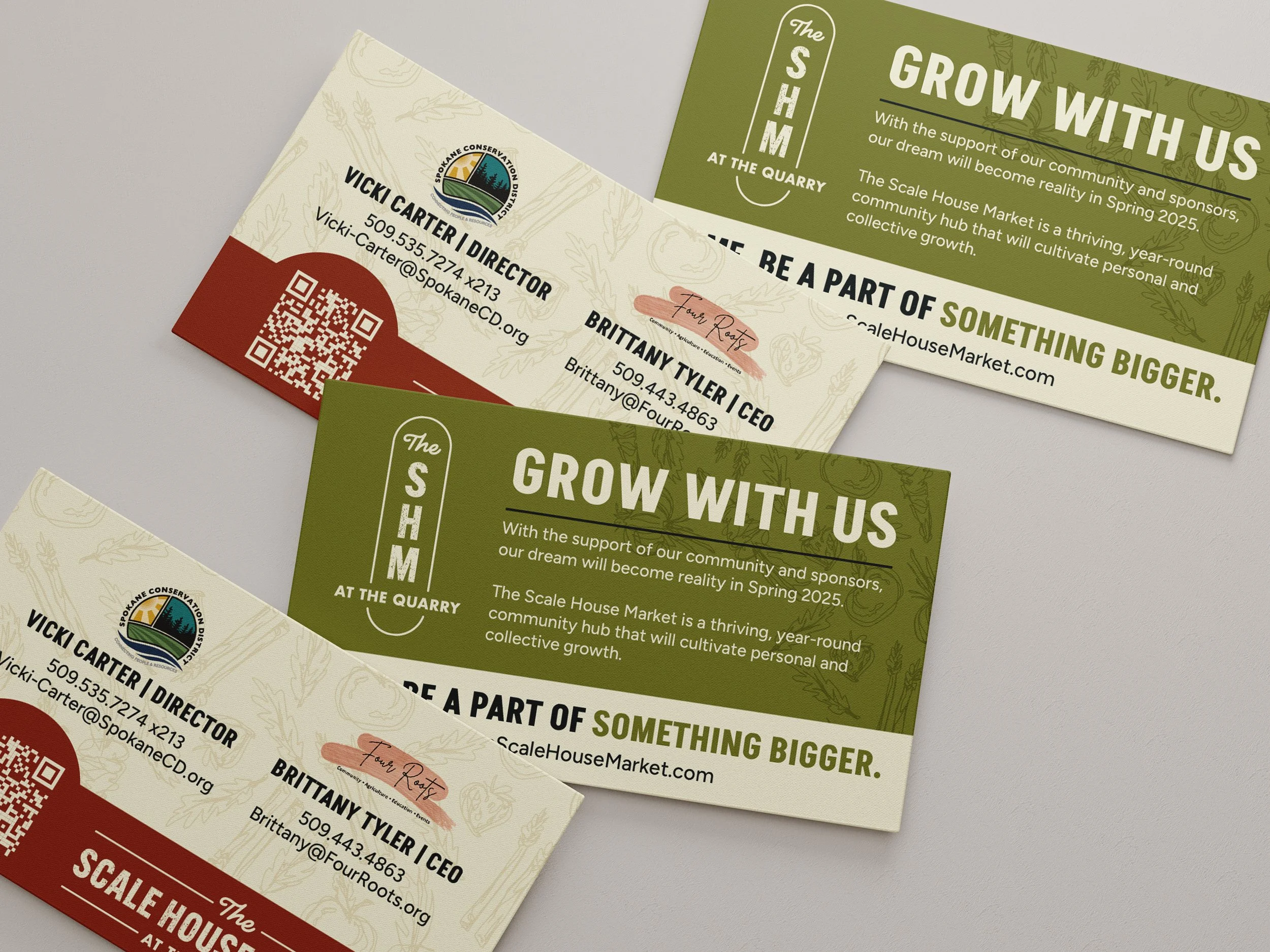
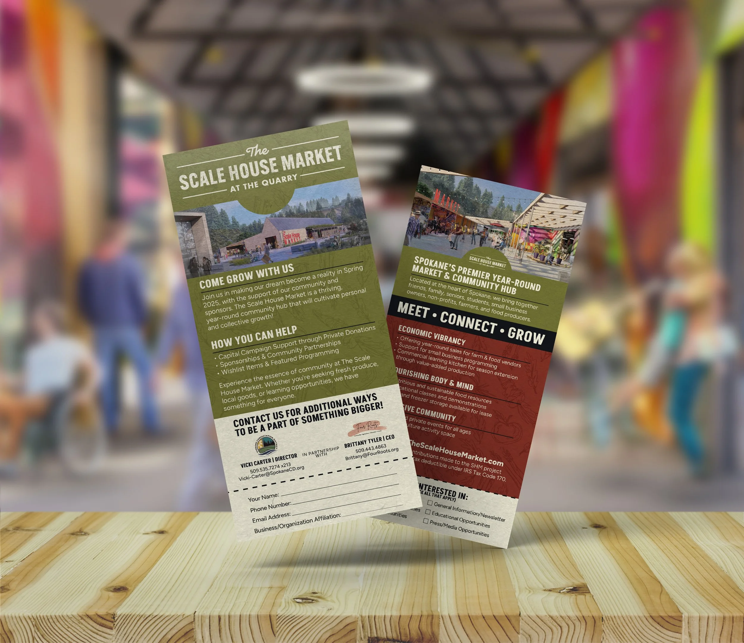
We created a unique brand for The Scale House Market, starting with the logo. The design seamlessly combined modern and traditional elements, featuring a bold, contemporary font paired with a rustic, weathered one. The custom cursive font for the word 'the' added a softer look compared to the bold font of the ‘Scale House’. This added softness creates a more friendly and inviting look. Additionally, we incorporated lines to provide structure and envisioned the logo's future use as a neon sign.
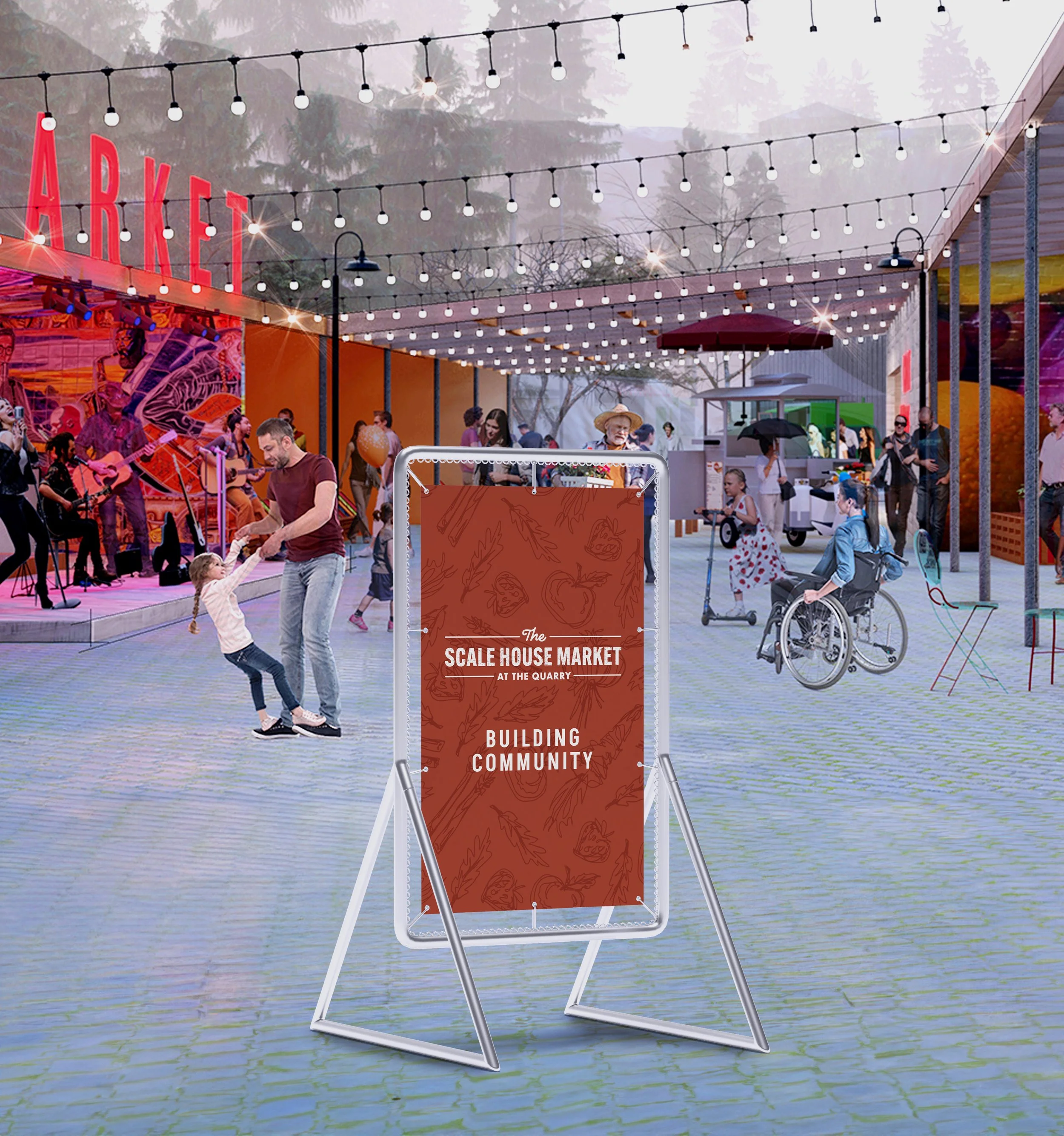
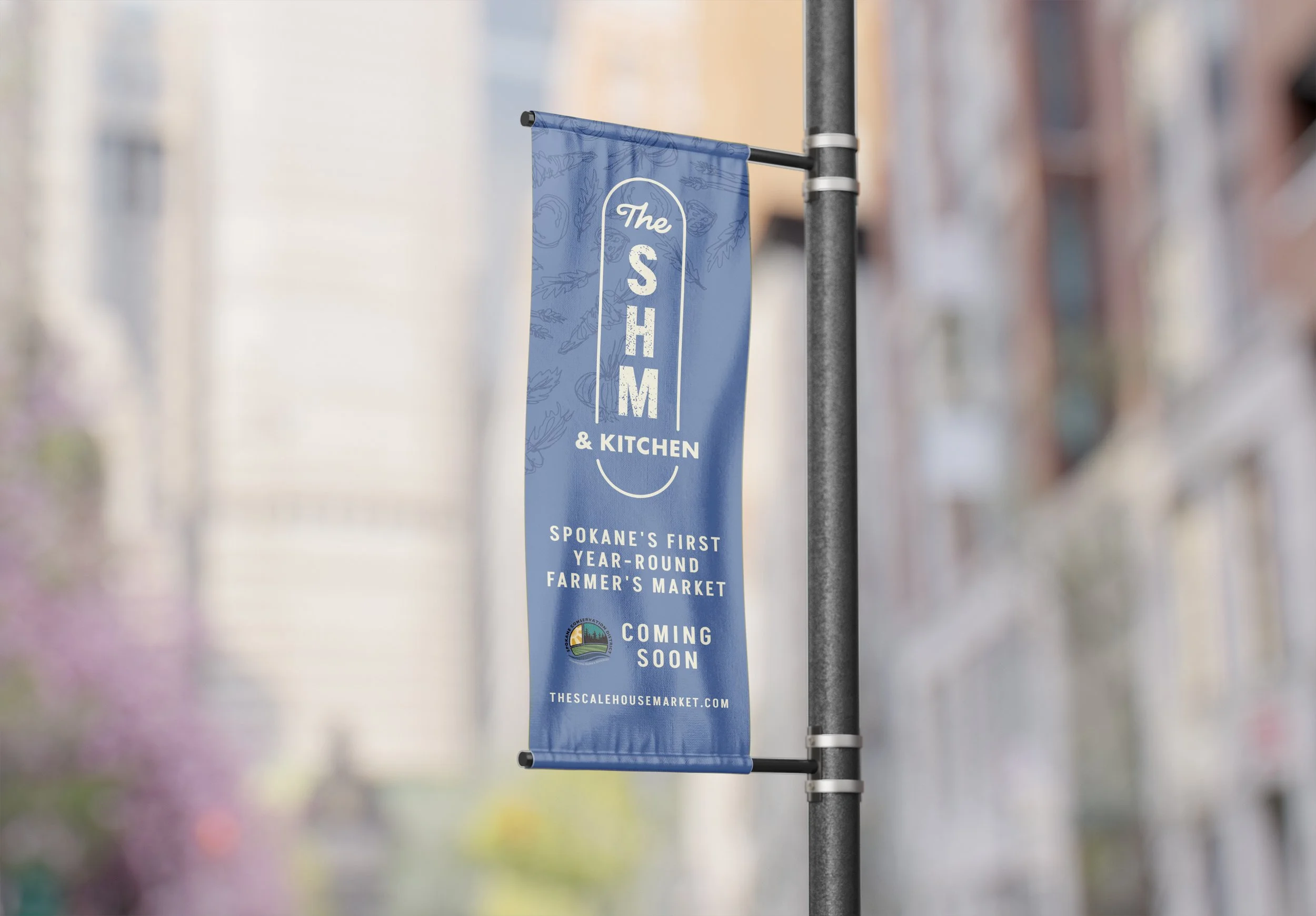
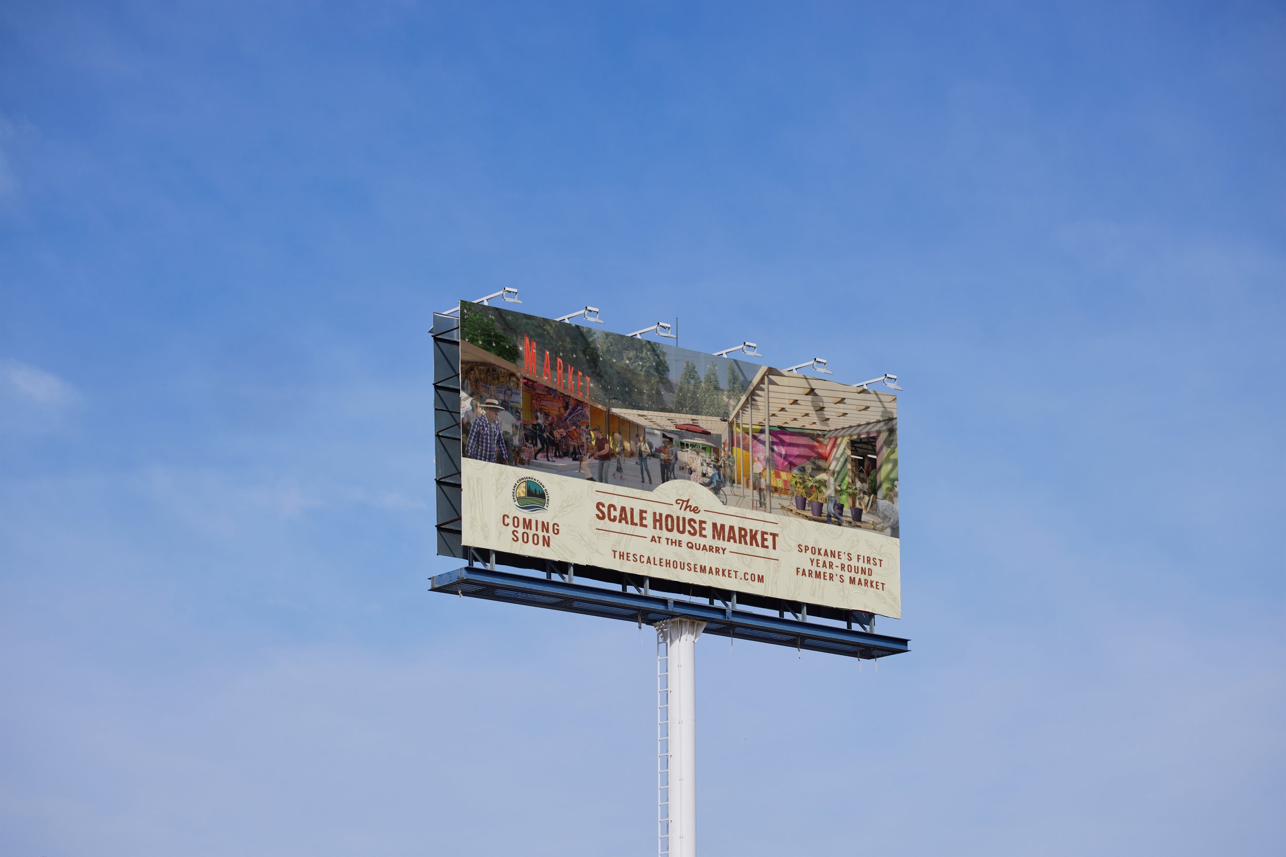
The new logo successfully conveyed approachability and familiarity while maintaining a strong presence. It effectively captured The Scale House Market's essence, positioning them as a dynamic and welcoming platform for community engagement. We have helped them by creating collateral items such as a rack card, brochure, and billboards, which further solidified their brand identity. Additionally, a custom texture was made that helped further define the brand. This branding initiative honored their mission and prepared them for future growth, including the visual impact of a neon sign on their building. The final design has been well-received by the community, enhancing the market's identity and presence in Spokane.